fbpx
?????? You can find our Black Week Deal here ??????

Font Pairing for Print on Demand designs

Fonts are sometimes the most important part of your design. It serves as a carrier of a message for your target audience. Your target audience must be able to identify with the design, especially the fonts, for it to have the potential to become a bestseller. Therefore, it is even more important to know what you are doing when it comes to fonts and font pairing for print on demand.

When it comes to which fonts are best to use for which audience, it’s a good idea to know your audience well beforehand and to have done your research. To get a better feel for when to use which fonts, we can recommend this video.

Terminology

First, let’s talk about two common terminologies. While the word typeface refers to the whole family, the word font stands for one member of this family. For example, Helvetica is a well-known typeface in which Helvetica Bold or Helvetica Light can be found as fonts. A font is a specific style or weight within a typeface. To be exact, the family members can even be divided into font sizes, so Helvetica Light 14pt counts as its own font.

However, nowadays font is widely used as a term for everything that has to do with text types. We just want to highlight this difference so that you are aware of the differences in the following guide.

Differentiation of Typefaces

Typefaces can be categorized into serif and sans serif which are commonly used to differ between typefaces. You can divide typefaces into other categories as well, but when it comes to font pairing, you’re mostly talking about serif and sans-serif. To choose the right font for your design you need to think about this categorization. What mood do you want the font to convey on your design? Should it make a statement without serifs or emphasize the joy of a joke with serifs?

What sounds very theoretical now, however, should not be underestimated, because in the end you want the fonts you use to match the feel of your design.

Font Pairing

Font pairing is one of the parade disciplines in merchandise design. There are no limits to your creativity and the courage to try new things. However, you should always follow the rule: Create harmony, not conflict.

You don’t want your typeface combinations to look boring and monotonous, but on the other hand you don’t want them to pull your designs in different directions. What you need is a happy medium that appeals to your target audience and inspires them to buy.

No matter how much text you want on your shirt, hoodie, or other merchandise, always stick to a maximum of two different fonts. Less is more. There are exceptions where it makes sense to use multiple fonts, but the safest thing to do is to use only one or two typefaces for now, unless you’re an experienced typographer that knows about all the do’s and don’ts for font pairing for print on demand.

Common Combination Methods

Same Typeface

Taking two fonts from the same typeface is somewhat unusual, but quite effective if you want to create minimal contrast.

Same Category

Combine two typefaces that are from the same category. This method is not too popular, because it is more difficult to create effective contrasts, but with some experience you can easily combine Serif with Serif or Sans Serif with Sans Serif.

Mix Categories

Choosing two typefaces from different categories is probably the most popular way to create contrasts. It doesn’t matter if you combine sans-serif with serif or use other categories such as display or monospace typefaces. In most cases, you can’t go too wrong with trial and error.

Methods beside pairing

Choosing different typefaces was the first challenge. Now it’s a matter of using them correctly and making sure that the message of the design comes across as it should.

The following measures can also help you with pairing:

Use the same font mood

There are several fonts within a typeface. Make sure that all fonts involved match each other and represent the same mood. No matter how well the chosen typefaces match, if you choose fonts that have different moods due to their font size and style, you can still mess it up.

Use letterspacing

To emphasize the contrast between two fonts, you should also play with the spacing between the letters. This can give an interesting twist to the word or phrase you want to focus on.

Good font combinations

Below we show you some font combinations that are suitable for font pairing for print on demand. Feel free to try out some pairs yourself and use the methods described above.

Bebas Neue & Cambo
Norwester & Montserrat Light
Playfair Display & Fauna One
Pacifico & Quicksand
Great Vibes & Oswald
Knewave & Roboto
Alfa Slab One & Gentium Book Basic
Bebas Neue & Roboto
Yellowtail & Open Sans Bold
Chivo & Unica One
Permanent Marker & Overpass
Potta One & Roboto
Six Caps & Archivo Narrow
Ubuntu Bold & Open Sans
Sacramento & Montserrat
Sofia & Quattrocento Sans
Shrikhand & Fanwood Text
Playfair Display & Six Caps
Chelsea Market & Anton
Alfa Slab One & Open Sans
Montserrat & Wire One
Spectral & Inconsolata
Cinzel Bold & Fauna One
Beth Ellen & Roboto
Oswald & Quattrocento
Fredericka The Great & Josefin Slab
Sacramento & Alice
Nunito & Megrim
Roboto & Raleway
Varela Round & Noto Serif
Shrikhand & News Cycle
Anton & Open Sans Light
Amatic SC & Josefin Sans
Lobster & Arimo Bold
Proza Libre & Six Caps

Licenses

Even experienced designers are not always clear about basic principles of font licensing and therefore problems may occur in daily use of fonts. When you buy fonts, you are not buying the font itself, but a right to use it. Licenses are usage contracts for software. One acquires the right to use the software, the terms of which are regulated in the End User License Agreement (EULA). The usage agreement is therefore always concluded between two parties, the licensor (font provider) and the licensee (font user).

In theory, this means that when a freelance designer purchases fonts and uses them in a design, he cannot resell his work to a POD operator or similar, as they do not have the rights to use a font licensed by him. Strictly speaking, POD operators would have to have the licensing rights to any font found on their purchased designs as well.

So, when choosing fonts on a marketplace, be clear about whether you need that font for yourself or a customer. Even if you can download fonts for free, you should be careful. Because free is not equal to free. Fonts that are available for free can have certain restrictions in the rights of use, for example they can only be for personal usage. Always make sure that commercial use is permitted in the usage rights.

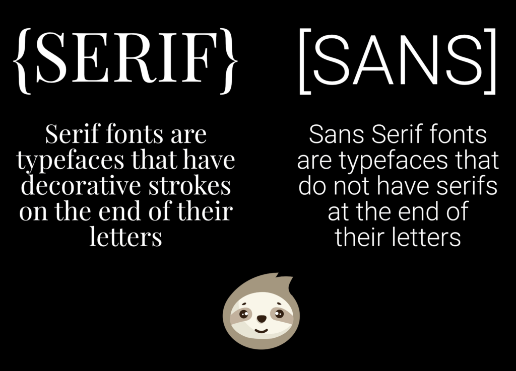
Google Fonts or Adobe Fonts offer their users a variety of license-free and commercially usable fonts, which should be sufficient for daily use in the POD. However, if you need or want to buy some special fonts from other platforms, pay close attention to the end user agreement and clarify what you are allowed to do with the fonts.

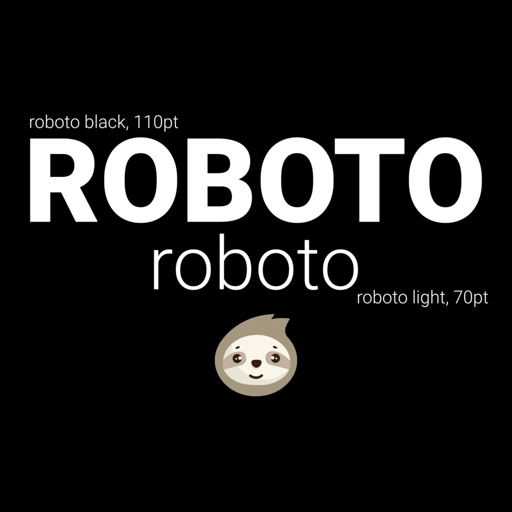
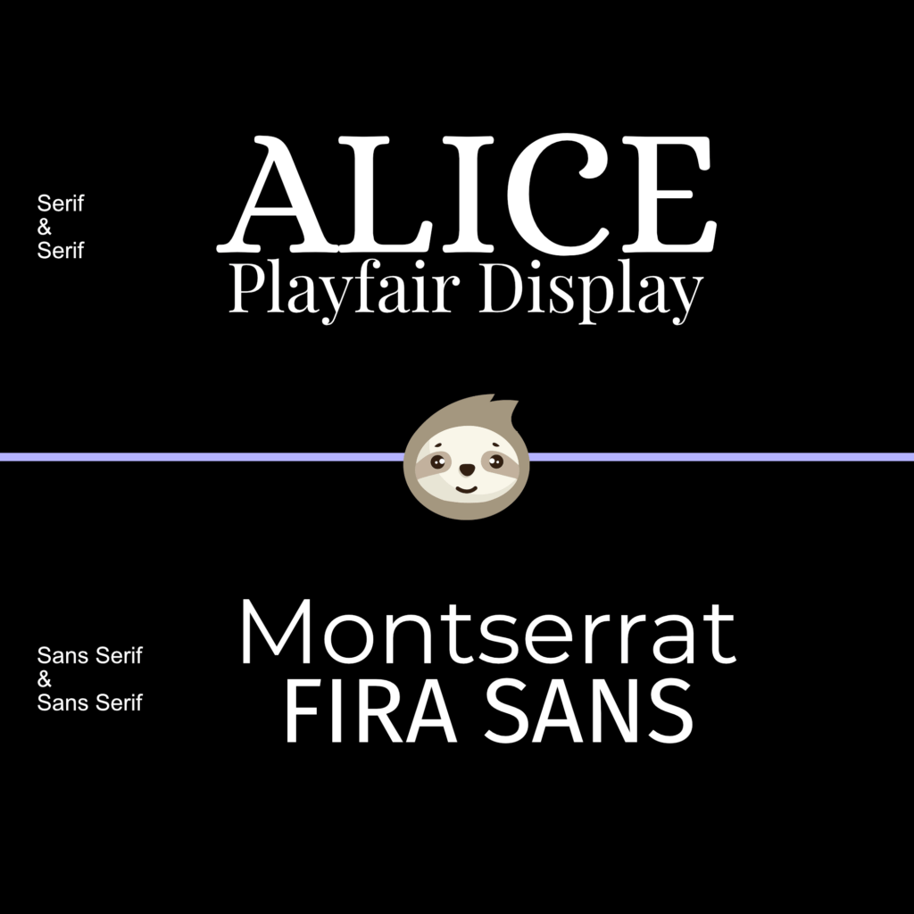
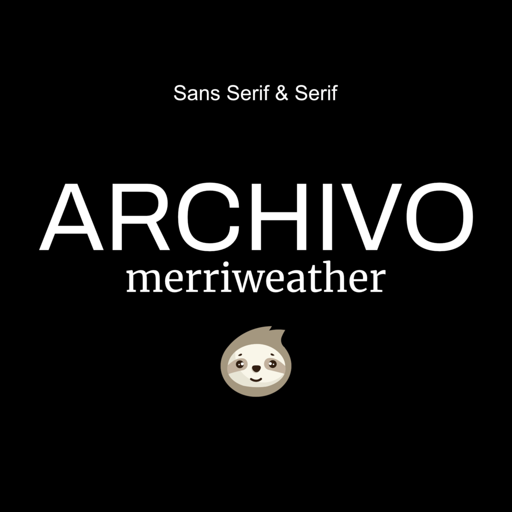
We can recommend the Google Fonts page, where you can browse through many different fonts. Also, in combination with the font management tool, which will be presented in the next paragraph, Google Fonts is a real miracle and you do not need to install the fonts manually on your device.

Manage Fonts

As a designer or someone who occasionally creates designs themselves for their POD business, it’s easy to lose track of the fonts you’ve downloaded and installed.

Every audience, niche, or feeling you want a design to evoke requires a rethink about which fonts or font pairing to use. Without a suitable font organizing tool, it’s impossible to remember which of the dozens of fonts you’ve created over the course of your design or print-on-demand career. Especially for font pairing for print on demand you need something to organize and save good font combinations.

At this point, we can recommend Fontbase. In this app, you can see fonts nicely laid out so you can choose which ones to consider. Furthermore, Fontbase comes with a large number of preinstalled fonts. You can create collections and favorite lists according to your mood, which is incredibly valuable for working in a structured way. Fonts that are not yet available in Fontbase can be added without any problems.

Conclusion

The topic around fonts is often very underestimated. They are an important part of an overall composition that a design wants to convey. Font pairings are an important technique for creating highlights, underpinning statements, or giving a punchline the right neutral touch. To find your way through the jungle of many fonts, you should be organized with a font management tool and be aware of the licensing rights of a font.

If this article helped you, feel free to share it with colleagues, collaborators, your VAs or designers and leave us a comment with your feedback. We’ll be happy to continually edit this article to include your feedback.

Leave a Reply

Your email address will not be published.